Showing posts with label drawing. Show all posts

Monday, September 10, 2012

My hero

This man right here is the reason why I am the way I am. Without him I would be nothing. He is my role model, my friend and my hero.

He is my Dad.

Tuesday, June 26, 2012

Daily Sketch David


Daily sketch. I had to re touched it in Photoshop a little bit... everything for the shot.

Sunday, June 24, 2012

Navdaks

This is what I call my doodles. The Navdaks.


Here is an old doodle from two years ago. Link

Sunday, June 3, 2012

Closing the Gap

Ever since I decided to do everything in my power to become a better artist, I've tried to help anyone that wants to pursue the same career path. I think that you can always learn something from somebody, if it is someone that is just beginning or someone that has been in the game for a while. You simply cannot say that you are an accomplished artist that knows what the deal is.

And specially when I talk to people that are starting at this, they seem to share a little bit of sene of disappointment at the beginning, because you are dying to produce awesome-jaw-dropping-juicy-delicious art that can inspire other people, and the fact is that, at least for the first years you will try your best to do so, only to find out that, for the most part your are not completely satisfied with your work. This can be frustrating, believe me I know, we all have been there.

That is why when I found this video, somehow it just clicked with all the right words and in the right tone. From now on I will have a solid message to share with all of my friends and future artists, because this is what it is all about.    

This is an excerpt of a longer interview made to Ira Glass, an american public radio personality, and host and producer of the radio and television show This American Life.

So here it is: http://vimeo.com/24715531 

And here is part 3 of 4 parts of the whole interview.


Friday, April 6, 2012

Dante

This is my final project for two of my classes: my Humor and Caricature class and my Production class.  The goal was to produce a cover and two pages for a comic book, could be original material or whatever. I chose Dante, the character I created at the beginning of the school year. I initially posted a sketch of both of these guys before here

Dante is an ant eater, he works as a bouncer at night clubs and he is cranky all the time. His buddy Javier is a heavy-smoking-booze drinking mandril. Here is the cover and the process.

Final color

Digital pencils
Digital inks
Done in Manga Studio Ex and colored in Photoshop CS5.

Wednesday, December 7, 2011

Batman Wrap Around Cover

Bats!

And now the process:

1. Digital sketch

2. Tighter lines  (badguys)
 3. Tighter lines  (goodguys)

4. Character Adjustments
 5. Finished pencils

6. Final Inks


Done as a project for one of my classes. The instructions were design a wrap around cover with two distinct focal points, one in front and one in the back that together could work as a poster.

I don't have the colored version yet, because the only thing that I have finished after the inks is just the color flats, and I don't consider that to be worthy of being published. So bear with me, I'll post it when I'm done with the colors.

Till then, rock on.


Monday, August 8, 2011

Thursday, July 21, 2011

The Fop Panel


Here is an almost finished inked panel from The Fop, a commission I have been working on.

More on The Fop here

This should not count for the daly sketch gimmick I propose myself yesterday, so I have to sketch someething later on today. Hopefully.

Thursday, June 30, 2011

Art Jam 15: Captain America


Another Artjam! wednesday. This time we selected good ol' Captain America, cuz, you know, the up coming movie and everything. Once we decided which character we were going to draw, I started with a couple of sketches. This serves me as warmups, because its very rare that I'm happy with the first idea.

They suck. I know.

So after an hour sketching and not going anywhere, EDSFOX convinced me that it was time for some concept art style. Try something new for a change. This is how I started the piece:

First the background. I imagined Cap to be in a heroic pose, with the camera looking up to the sky. Maybe a town is burning down in flames faw away. This is completely backwards from what I usually do. I usually start with the sketch of the character and then place it in a place. But different is new and new is always better.


Then I sketched the pose and silhouette of the character (heroic remember?) , with the intention of creating everything with the brush strokes in Photoshop.


I don't have in between stages from the initial strokes to the final touches, but all I can say is that the process was kind of discovering where I wanted Cap to be in relationship with the background.


At first I haven't thought of the Shield, but my buddy Eds reminded me that it was such an icon, I had to include it. At the end the important aspect was a very bright light, contrasting with the background, giving him details only in certain parts I wanted to enhance for the viewers (face, chest, left hand and shield)

The cool thing was that I almost finished the whole thing in a very short period of time. I know that it doesn't have that much of detail, but, I think this is the essence of concept art, just with brush strokes and gestures, artists create remarkable and wonderful worlds that later will turn into fantastic entertainment.

If you want to see some wicked painting styles check out the entries for The Rift videogame contest.
Also one crazy artist: David Rapoza

Until next time, keep rocking and drawing!

Wednesday, May 18, 2011

Art Jam 12: The Crow

90's rule


Tribute to The Crow.

Sketched during last week's ArtJam! and colored yesterday.

I kinda rushed the coloring and decided to do it Cell Shaded style because of the time I had to my disposal. I was sick with the flu last week, and I kinda slacked off for a bit. I know that is not an excuse :P

Done in Photoshop CS5. Around 5 hours.

Monday, April 4, 2011

The Legend of Zelda Tribute


By Odin, at last it is finished.

This is the longest I have ever worked on a piece, not because of the size of it, because I didn't do it in one sitting but over the course of 3 months, a few hours at the time. Also, I needed it finished it cuz' I want to include it in my portfolio for a special project that is in the making. This is it, I will explain this step by step. Don't think of this as a tutorial, but more like a general description of the whole process.

1. Sketch


Being a tribute to one of my favorite games  I wanted to do something that felt complete, I mean with full characters and a decent background in some sort of surprise battle. I also wanted to do a mix up of two of the Zelda games, (Twilight Princess and Wind Waker) so I chose the Lost Woods as the scenery, Link for the first game and Ganon for the second game (my favorite versions of both of them).

2. Tighter Lines


Once the characters and the background have been placed, I started to tight up the lines of the sketch. Doing digital art gives you the advantage of working really fast and to be able to correct things more easily. I concentrated myself on the details such as clothing and the faces first, then I moved to the trees and the rest of the forest. I used reference shots for Link's Shield engravings and his uniform, as well as for Ganon's outfit. I did took the liberty of putting some medieval boots on him.

3. Inks

Then it comes the inking stage. Here I just winged it, trying not to put much thought on perfection or something really squeaky clean. This was all done on Sketchbook Pro so I took the opportunity to experiment with some of the pencil bushes, giving them the appearance of inking brushes with a lot of texture, specially on the shadows of the tree branches. I just tried to have fun with the whole thing.

A couple of detail shots


Now, on to Photoshop CS5. This is where it gets fun!

4. Color I: Flats
  
 This stage is kind of new to me, and I learned it thanks to the fabulous Art Jams that I have been rocking with my buddies EDSFOX and Martegod. Flattening is just creating massive blocking of colors separating all the parts of the illustration. This is the part of the process that tends to be a little bit tedious for me. But, that being said, it is extremely helpful later on. I keep this on a separate layer just below the coloring layer. I used bright and contrasting colors so when I use Photoshop's Magic Wand (Shortcut W ) I don't have a hard time selecting the chunks of color. The fact that you are able to select anything on another layer is just ridiculously time saving speeding things up, boosting your productivity to the maximum.

5. Color II: Base color

Using the flats as my base, I separated each of the base colors I will use for each part. Some of them changed a bit during the process, but you get the idea.

6. Color III: Light Source

I used a visual map for the illustration, pointing out which parts I want to bring out more, maybe with a lot of detail or with a specific kind of light.


With my base color and my visual map ready, I state my sources of light so I can start to color accordingly.


Again this is just a guide. Things may change as I move along.

7. Color IV: Wrapping it up


I focused on the two characters using the beam of light as the main source, I wanted it to kind of reflect on everything around Ganon. I used this as the premise of the illumination and color placement of the illustration. The ambient blue on the background is just to give some contrast and depth to the piece.

8. Sweeting things up.

For the finishing touches, a couple of Hard light tricks and Screen glows here and there, just to sweet things up.


I could describe my whole coloring process as kind of a mood setting using color theory, the message you want to communicate and my gut feeling. You have to know when to stop, and strangely, one nows when it is ready. I admit I have to study more color theory so the jobs can get better, but as with everything, it is a matter of watch and learn.

That's it! Again, it was a tough one but I had a lot of fun doing it all the way.

I hope I don't disappoint all you Legend of Zelda fans everywhere. If this serves you in some way my mission is accomplished. And as always, all comments and critics are welcome.

Thursday, March 31, 2011

Spidey Colors


For all you color junkies, here is the process I went through to put some color to my first ever Spiderman illustration.

No music on this one either. Done in Photoshop CS5.

Here is the finished thing.

Friday, March 25, 2011

Art Jam 6: Spidey


I have a couple of unfinished drawings on my Laptop. They are either sketches that went too far and turned into almost finished illustrations or half finished tributes. But  I wanted to specially tackle this one since I started it.

On this week's Art Jam, EDSFOX and I wanted to explore our style of coloring. Each of us took a finished sketch and practiced coloring. Just relaxed and drinking coffee. MarteGod couldn't make it, (coloring Marvel comics is a tough job) We hope to see you very soon bro.
So here is my first Spidey ever. I'm surprised that I have never really try to draw famous characters such as this one before. The background is just an experiment so the character wouldn't felt so alone on the layout.


Done in Sketchbook Pro and colored in Photoshop CS5. 

Tuesday, March 22, 2011

Digital Art Process : Pencils


About a month ago I posted the general process I follow when I'm doing a commission. I also said that I record the whole process and I would post it. Here it is the first of three posts of the whole thing:

The drawing process.

This was done on Manga Studio Ex 4. My review of the software is still pending. For now I leave you with the video post. Hope it helps you.

Friday, March 11, 2011

Art Jam Mike Colors


As I said before, the only way to improve is through hard work and to surround yourself with better artists than you. And if they happen to be awesome people, well, it doesn't get any better than that.

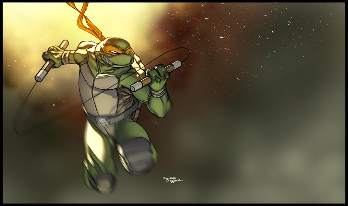
This is the result of last week's Art Jam with Martegod. He deliciously colored Michaelangelo and I couldn't  be more impressed with his work! What can I say... the guy is insanely good.

Be sure to check out his work http://martegod.deviantart.com/ you wont regret it.

Thursday, March 10, 2011

Art Jam Leo Colors


Here is the colored version of last week's Art Jam Leo with EDSFOX. I did the color of his work, and apparently he gave me the thumbs up.

His only request was that, maybe next time I could include something in the background.

Friday, February 25, 2011

Art Jam Numero dos: Ryu

First Ryu ever. Honest.


I went to my favorite Starbucks with my buddy EdsFox for an Art Jam. In my book this means Laptops + Tablets + coffee + good looking women = fun. This is the second time we get together to jam, and the idea is to keep doing it and inspire more people to join us.

While the first time we talked and discussed several subjects related to illustration, we pretty much did our own thing. This time we came up with a set of  rules to make it more interesting:

1. We had only 30 min. to draw
2. We would have to draw the same character. (in this case Ryu)
3. We would have to use the same software (in this case Photoshop CS5)
4. Once finished the sketch, each one had to color each other's drawing.

I tried to draw as fast as I could keeping the lines loose keeping that sketchy look, even though it was being done in Photoshop.

It was fun! Of course we extended the time up to 50 min (just cuz we wanted a little bit more detail, and we didn't finish the color part, but we will continue next week.